User status
Watched Now
GET YOUR DEALS HERE LIMITED TIME OFFERS!
  • Please update your payment method to a card to enable the credit streak rewards.
  • We have a limited number of special packages per hour.

    Please check back in a few minutes or when you see this tab change color.

    Enjoy VIP treatment in chat rooms, discounts on products and unlimited access to your recorded shows.
    CREDITS
    credits FREE!
    Only 1 remaining!
    // VIP ONLY //
FREE CREDITS!
0
Create Free Account
CONGRATULATIONS!
LIFETIME STATUS INCREASED!
Your Status has moved up from “REGULAR” to ...
SUPERSTAR
X
CONGRATULATIONS!
CURRENT LEVEL INCREASED!
LEVEL
X
X
Free VOD Passes

You have free video passes available! Use them before they expire.

Redeem your pass during the video purchase process by selecting Free Pass.

Go to Videos now.

Processing your request ...
Please wait while we attempt to process your request.
X
Process Failed
We were unable to process your request. Please try again.

Forums / News & Announcements

Major Site, Search, and Sort Improvements Now Live!
More Actions

Add to List

X

Select a list to add

Item was successfully added to this list

No list available

Add to List
Add Reply
News & Announcements: Major Site, Search, and Sort Improvements Now Live!
Created by: vsbwelch

10/7/20 @ 4:20pm (EST) |UTC - 5:00
Posts: 19

The improvements to your Flirt4Free experience continue to roll out. This week, we have some sleek aesthetic changes to share with you, as well as an overhaul to our model search and sorting. Here's what’s new:


First, we've greatly reduced the amount of text you'll see when you browse the main page. This will let you see each model's bio pic or preview their room without clutter. The model's name now appears as unintrusive text. The colored dot next to it will let you know if they’re in open chat (blue), premiere chat (gold), or any other room state. (pink still means party chat, yellow is group show). The interactive icon in the upper-left corner of each pic will let you know if each model is interactive-enabled and what device they have ready to use.


As before, if a model is in a paid show, their image on the main page will be slightly grayed. We've also added a small room-state tag to let you know if they're in private.

We've changed the model-info flyout into a simple dropdown too, to make it cleaner, and give you more info at a glance. You can add them to favorites, send them a message, turn on email notifications, or jump straight into the models room from this simple menu.

To open this dropdown, click on the options icon on the top right of each profile image. You can also enter a model's room in a new browser tab by clicking the pop-out icon beneath it.


We've added a High Definition option, so you can see each profile image in its highest-quality form.
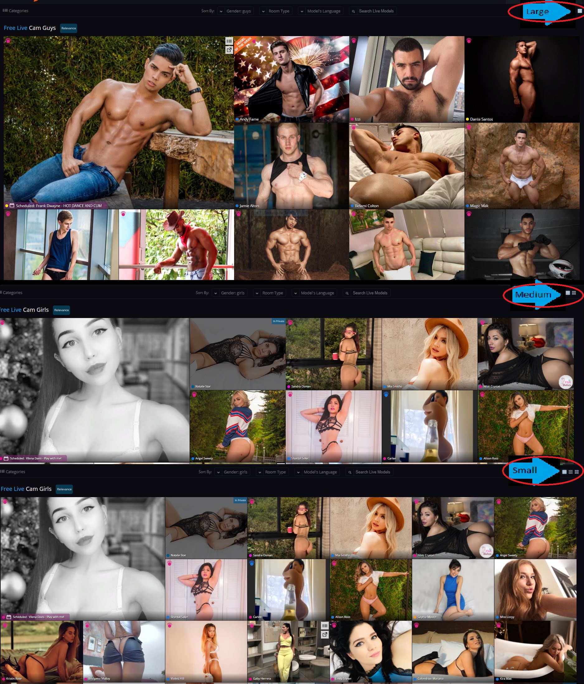


We've also added a new option that lets you decide how you browse. When you log in, your view of the main page defaults to the Largest setting. By clicking the tile buttons in the top right corner, you can reduce the size of each profile image, and browse more models at once. There is a medium setting and a small setting for maximum Flirt efficiency.
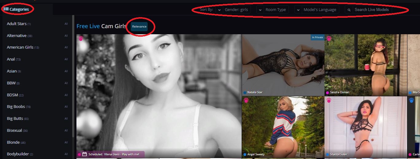


Ok, you're done browsing, and you want to pare down your choices to suit your tastes. We’ve made this experience quick, easy, and intuitive. First, we've relocated the Categories button to an expandable menu. We've also added a number of other search parameters. Search by gender, Room Type (such as party chat, group show), and view only new models.


See only models that are currently online and suit your specific needs. Clicking any category will add it to the filter bar so you can zero in on the right model for you. Simply click the "X" to remove the filter.
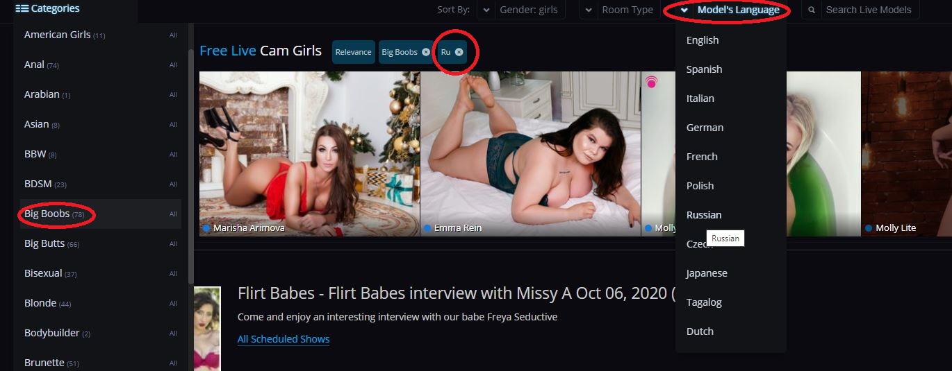


If you want to avoid a language barrier, or if you prefer your dirty talk in a specific dialect, you also have the option to filter by language, as shown above.


You can also add a name filter when you're looking for a very specific special someone. Type the name, and choose a model from either the drop-down suggestions list or from the profile images of those who make your search results list.
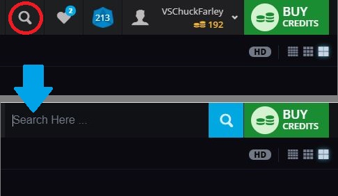


Finally, you can still search the site as before. We briefly moved the site search window to the "My Account" dropdown as part of our redesign. You'll be pleased to know that is now in the top bar once more. Simply click on the search icon to open the text entry field.

We hope these changes make for a more intuitive, enjoyable site experience. This sleek new design and updated search and sort should help you get into the action quickly. And please, share your feedback, questions, or concerns in the comments section below this post!

For a catalogue of other recent changes, check out the Site Updates section of the Flirt4Free blog.
Quote
BruceAW
Created by: bruceaw

10/7/20 @ 5:33pm (EST) |UTC - 5:00
Posts: 69

It does not look like the 'Room Type' is saved (reverts to Relevance) when returning to the main page.
Quote

Created by: vs_jamie

10/7/20 @ 6:14pm (EST) |UTC - 5:00
Location: CA
Posts: 2,326

It does not look like the 'Room Type' is saved (reverts to Relevance) when returning to the main page.


Thanks for the feedback. Our thought was to treat those filters the same as the other filters but we'll go ahead and switch it back to how it worked before as we can see how that could be a better experience.

Quote
JoeSomebody1
Created by: joesomebody1

10/7/20 @ 7:49pm (EST) |UTC - 5:00

Nice additions I'm guessing these are only computer and not mobile? Still waiting for the mobile option that it doesn't jump to the bottom of chat every time something new (text, tip, vote, etc.) is posted. That really is the only mobile update I want. Thank you!
Quote
Zuzar1
Created by: zuzar1

10/7/20 @ 7:59pm (EST) |UTC - 5:00
Location: California
Posts: 220

Where it says relevance is where it should be possible to sort how the main page is organized. As previously posted the "room type" does not save when reloading the page. Although I think of something completely different on the subject of "room type" than how it is currently setup, but I will get to that a bit further into this post.


The interactive icon for devices does not currently display anything when clicked on for me. I would love to see what type of devices a model or models have available. Right now it's not working. Also like before there should be a noticeable difference between tip controlled and interactive.

Since the trend seems to be an increase in symbols to represent things over words (not sure how well that will be received) it would make sense to differentiate the availability of multiuser, private, exclusive private, combos in those symbols along with party, group, and fan club only chats. Also display the broadcast aspect ratio because despite some cams supposedly broadcasting in HD it is terrible finding out later the actual aspect ratio (listed as size) is 852 x 480 or 640 x 360 or something else less than 1280 x 720 which make them not high definition. Granted 1920 x 1080 is real HD and it would be fantastic to see that show up more often instead of the lower 1280 x 720.

Alright so the phrase "Room Type" should be the notable features of a room: a chair, a couch/sofa, a bed, a shower/bath, a dance pole, full length mirrors, a fucking machine, a well equipped room for bdsm, etc. Additionally it would be nice knowing without having to ask if it is possible for the camera to be picked up and moved to a different spot in the room, if the camera has zoom capability, and autofocus as well.
Quote
Created by: vs_jamie

10/7/20 @ 8:28pm (EST) |UTC - 5:00
Location: CA
Posts: 2,326

Nice additions I'm guessing these are only computer and not mobile? Still waiting for the mobile option that it doesn't jump to the bottom of chat every time something new (text, tip, vote, etc.) is posted. That really is the only mobile update I want. Thank you!


Yes, only desktop currently but we will look into updating that mobile "jumping" experience for you as well.

:thumbsup
Quote
Created by: vs_jamie

10/7/20 @ 8:38pm (EST) |UTC - 5:00
Location: CA
Posts: 2,326

Where it says relevance is where it should be possible to sort how the main page is organized. As previously posted the "room type" does not save when reloading the page. Although I think of something completely different on the subject of "room type" than how it is currently setup, but I will get to that a bit further into this post.


The interactive icon for devices does not currently display anything when clicked on for me. I would love to see what type of devices a model or models have available. Right now it's not working. Also like before there should be a noticeable difference between tip controlled and interactive.

Since the trend seems to be an increase in symbols to represent things over words (not sure how well that will be received) it would make sense to differentiate the availability of multiuser, private, exclusive private, combos in those symbols along with party, group, and fan club only chats. Also display the broadcast aspect ratio because despite some cams supposedly broadcasting in HD it is terrible finding out later the actual aspect ratio (listed as size) is 852 x 480 or 640 x 360 or something else less than 1280 x 720 which make them not high definition. Granted 1920 x 1080 is real HD and it would be fantastic to see that show up more often instead of the lower 1280 x 720.

Alright so the phrase "Room Type" should be the notable features of a room: a chair, a couch/sofa, a bed, a shower/bath, a dance pole, full length mirrors, a fucking machine, a well equipped room for bdsm, etc. Additionally it would be nice knowing without having to ask if it is possible for the camera to be picked up and moved to a different spot in the room, if the camera has zoom capability, and autofocus as well.


Thank you Zuzar for your detailed thoughts.

To answer a few of the issues you brought up:

- if you hover on the interactive icon, it will tell you what device the model has - this hasn't been updated - for example "Tip Controlled - OhMiBod Available" is what I see on one I just tried. Please let us know if you don't see the same.

- Nothing changed with the different tip controlled vs interactive also - a model with 2-way interactive used to have a purple banner that said as much and now it's a purple icon and you can see device on hover. If you cross-reference with the interactive page you should be able to compare and see the same but let us know if you don't for some reason.

- The HD option at the top provides high resolution images or not for the homepage images and isn't referring to the video quality. We'll definitely take your ideas on video quality filtering/sorting into consideration however as we do understand how it can vary.

Thanks for the other suggestions as well!
Quote
JoeSomebody1
Created by: joesomebody1

10/7/20 @ 9:02pm (EST) |UTC - 5:00


Yes, only desktop currently but we will look into updating that mobile "jumping" experience for you as well.

:thumbsup


Awesome and thank you! Another thing I like is when we sort by room type it includes our favorites in the sorting below favorites. That makes things easier when you have a lot of favorites and are color blind lol. Thanks!!!
Quote
Zuzar1
Created by: zuzar1

10/8/20 @ 8:04am (EST) |UTC - 5:00
Location: California
Posts: 220


Thank you Zuzar for your detailed thoughts.

To answer a few of the issues you brought up:

- if you hover on the interactive icon, it will tell you what device the model has - this hasn't been updated - for example "Tip Controlled - OhMiBod Available" is what I see on one I just tried. Please let us know if you don't see the same.

- Nothing changed with the different tip controlled vs interactive also - a model with 2-way interactive used to have a purple banner that said as much and now it's a purple icon and you can see device on hover. If you cross-reference with the interactive page you should be able to compare and see the same but let us know if you don't for some reason.

- The HD option at the top provides high resolution images or not for the homepage images and isn't referring to the video quality. We'll definitely take your ideas on video quality filtering/sorting into consideration however as we do understand how it can vary.

Thanks for the other suggestions as well!


I use a touchscreen so that's probably why I didn't realize the device info was not an update since hovering isn't an option for me. I do see the purple icon though.

HD images on the home page? That's interesting, I'm often disappointed by the poor representation of models thumbnails and not because of the image quality of those thumbnails. While some models do look the same when broadcasting as in their thumbnail there are those who do not. These images provide a first impression and that will determine whether or not I want to look at a profile or enter a chat room. Aside from physical features increasing or decreasing my interest in the thumbnails, by watching in a chat and interacting, and reading a profile my biggest disappointment comes from misrepresentation of broadcasting location. Plenty of models might have taken a picture near a bath or shower, but they don't actually have access to them to utilize for shows. The same could be true of a bed, some models just sit in chairs or on couches. A model might take a picture at a beach or outside somewhere yet they have no way to stream anywhere outside let alone the location they were photographed at either inside or outside.
Quote
Created by: domrlover

10/8/20 @ 7:43pm (EST) |UTC - 5:00
Location: UK
Posts: 94

It would be nice if when a model is in private, exclusive private or multiuser, it said so that the top, not just "in private" for all the options!! I know there is a work around by clicking on the little icon, but as some users use phones/tablets, this can be quite a challenge, and it makes it easier to just glance at what they are in, rather than having to check every time!!

Thanks for listening to my insight!

However, I am getting used to the new layout and I must say I quite like it if I am honest!! well done to the tech team on most of these changes recently :D
Quote
BruceAW
Created by: bruceaw

10/8/20 @ 8:31pm (EST) |UTC - 5:00
Posts: 69

It does not look like the 'Room Type' is saved (reverts to Relevance) when returning to the main page.


First thanks for getting this done so quickly :thumbsup
another suggestion - maybe expand the 'In Private' label to show things like 'Voyer', 'Multi' and 'Private' could remain as exclusive.
Quote
Max_Lovers
Created by: max_lovers

10/9/20 @ 12:16am (EST) |UTC - 5:00
Posts: 6

First time on the website since the site improvements so I still try to learn to use all the new features but I have 2 things to say.
I think it would be a good idea to add a black background (lets say at 50% opacity) behind the name of the model to better read the name because white names on the profile picture of the models is not the easiest thing to read.
Also, when we are in the model chatroom, unless you move the mouse on the video, there is no place where we can see the name of the model. Maybe there is a way to add the model's name somewhere.
Thank you :)
Quote
Created by: vs_jamie

10/9/20 @ 7:08pm (EST) |UTC - 5:00
Location: CA
Posts: 2,326


First thanks for getting this done so quickly :thumbsup
another suggestion - maybe expand the 'In Private' label to show things like 'Voyer', 'Multi' and 'Private' could remain as exclusive.


Thanks for the suggestion - we've gone ahead and added this for additional clarity.
:thumbsup
Quote
Created by: vs_jamie

10/9/20 @ 7:12pm (EST) |UTC - 5:00
Location: CA
Posts: 2,326

** REMOVED BY ADMINISTRATOR **
Quote
Created by: vs_jamie

10/9/20 @ 7:12pm (EST) |UTC - 5:00
Location: CA
Posts: 2,326

It would be nice if when a model is in private, exclusive private or multiuser, it said so that the top, not just "in private" for all the options!! I know there is a work around by clicking on the little icon, but as some users use phones/tablets, this can be quite a challenge, and it makes it easier to just glance at what they are in, rather than having to check every time!!

Thanks for listening to my insight!

However, I am getting used to the new layout and I must say I quite like it if I am honest!! well done to the tech team on most of these changes recently :D


This is now added, thanks for the feedback and glad you're liking the changes!
Quote
BruceAW
Created by: bruceaw

10/9/20 @ 8:11pm (EST) |UTC - 5:00
Posts: 69

Thanks and a job well done :thumbsup
Quote
Zuzar1
Created by: zuzar1

10/10/20 @ 10:36am (EST) |UTC - 5:00
Location: California
Posts: 220

Took me a few days, but I just realized the stream quality indicator is no longer showing. It used to be possible from the little pop up menu to see if someone was supposedly* broadcasting in HD. Showing this bit of data again would be great.

* I wrote supposedly because after the fact I've found VODs of shows I did to have standard definition aspect ratios.
Quote
Created by: vs_jamie

10/15/20 @ 4:18pm (EST) |UTC - 5:00
Location: CA
Posts: 2,326

Hello, I wanted to let you guys know we've added an additional on/off feature for the homepage - country flags! So if a model has set their country on their bio, it will pull the flag and display it on their image. It is defaulted as off, but you should see it under "Room Type" and the last item on the menu. Please let us know if you experience any issues.
Quote
sensualmuse
Created by: sensualmuse

2/21/21 @ 10:47am (EST) |UTC - 5:00
Posts: 24

It would be really helpful to have some sort of search option for the 87 pages of the fan clubs list.
Also, could you set the link for fan club on a bio page to list first in the result the fan club for that person instead of just giving the 87 page list to wade through. If we’re clicking a fan club link from a bio page, it seems safe to assume we’re looking for that fan club.
Quote
Created by: nystingray

2/21/21 @ 12:11pm (EST) |UTC - 5:00
Posts: 870


Also, could you set the link for fan club on a bio page to list first in the result the fan club for that person instead of just giving the 87 page list to wade through. If we’re clicking a fan club link from a bio page, it seems safe to assume we’re looking for that fan club.

If you are on the model's bio page, under Profile Action Menu, scroll down to Join My Fan Club, it will take you to Visit My Fan Club Site. Just what you asked for.

Quote

Model Messages

Your Screen Name:
Register to message
VIP credits: VIP members receive 100 bonus DM credits each month. These credits do not carry over to the following month.
Open/close recents and search.

    Inbox

  • Sasha Elite
    2 h ago
    Lorem ipsum dolor sit amet dolor elips
    • Block The Model
    • Unblock The Model
    • Delete History
  • No results

    All Models

  • Sasha Elite
  • No results
    0 unread
    0 messages
  • Sasha Elite
    2 h ago
    Lorem ipsum dolor sit amet dolor elips
    • Block The Model
    • Unblock The Model
    • Delete History
  • Inbox is empty
  • No results
Reconnect

Connection Interrupted Try To Refresh The Page

Eva Sin Lorem ipsum dolor sit amet, consetetur sadipscing elitr, sed diam nonumy eirmod tempor invidunt ut labore et.
Johny123 Stet clita kasd gubergren, no sea takimata sanctus est.
— Admin Message — Stet clita kasd gubergren, no sea takimata sanctus est.
— AdBlock Detected — Attention AdBlock/AdBlock Plus User: There is a known compatibility issue between this adblocker and DM+ connections. If you cannot connect to DM+, we recommend disabling AdBlock/AdBlock Plus, or switching to an alternative ad blocker for an improved experience. Thank you for your cooperation!
— Admin Message — Stet clita kasd gubergren, no sea takimata sanctus est. Try Again
Eva Sin
See Photo
Unlock Photo 10 Credits
Johny123
Reconnect

Connection Interrupted Try To Refresh The Page

Want more emojis?
  1. Click the "Send a message..." area
  2. Right-click current area
  3. Select "Emoji" or "Emoji & Symbols"
  1. Click the "Send a message..." area
  2. Open "Edit" menu
  3. Select "Emoji & Symbols" (^⌘SPACE)
This model charges 10 credits per message
Customer Service Help
Chat

ALERT: Upgrade your browser

We are no longer supporting this browser.

You are currently using Safari version 9 (2015) or earlier, which will have problems with our players. We will no longer be supporting Safari version 9, please upgrade to Chrome, Edge or FireFox. If you have further questions please see Customer Support.

You are currently using Internet Explorer 11 (2013) or earlier, which will have problems with our players. We will no longer be supporting Explorer 11, please upgrade to Chrome, Edge or FireFox If you have further questions please see Customer Support

120

FREE CREDITS

Feature Show Ticket
Credits
VIP STATUS
Instant Full Access
Gold VIP Font
Up to 10 Reserved Nicknames
Email performers with attachments
Largest Private Video Preview
Turn Off Free Users Chat (No Gray Users)
Access to VIP Forums
Free Unlimited Access to Your Own Recorded Shows
Free 150 Daily Videos Available for 7 Days
Free 1 Hour Feature Shows and access to Archives
Free Access to Adult Star Video Archive
Free Access to Model Photo Galleries
VIP
30
Day
Membership
PLUS
150
CREDITS FREE!
PASS
90 CREDITS
$10
120

FREE CREDITS

Change
Feature Show Ticket
Change
Instant Full Access
Gold VIP Font
Up to 10 Reserved Nicknames
Email performers with attachments
Largest Private Video Preview
Turn Off Free Users Chat (No Gray Users)
Access to VIP Forums
Free Unlimited Access to Your Own Recorded Shows
Free 150 Daily Videos Available for 7 Days
Free 1 Hour Feature Shows and access to Archivess
Free Access to Adult Star Video Archive
Free Access to Model Photo Galleries
VIP 30 Days of Membership
PLUS 150 CREDITS FREE!
$39.95*
Change
PASS
$39.95*
Change
Card Verification(CVV2)
The CVV2 number is a special number printed on your credit card and provides extra fraud protection.
Complete Purchase
Access Private Nude Shows
SIGN UP FREE!
X
Suggested Usernames:
Usernames and passwords are CASE SENSITIVE
I confirm that I am 18-years old or older. I have reviewed and agree with the website Privacy Policy and Terms of Use & to receive emails